
My Video Ads Measured Perfect and Still Looked Like Slides
A tool that turns a product URL into ad videos in every aspect ratio. The animation problem was measurable, I fixed it, and the result still felt like a presentation. The second fix was structural.
I wanted one command that takes a product URL and gives me back an ad in every size a platform will accept. Vertical for Reels and Shorts, square and 4:5 for feed, wide for YouTube. Not one video with black bars added, which is what most tools do and what the platforms quietly punish you for.
That part worked quickly. The part that took three attempts was making the output feel like a video at all.
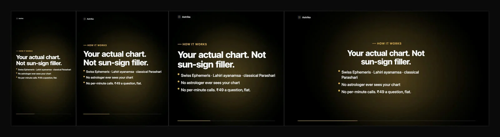
The first draft was a slideshow and I could not say why
I rendered an ad for my own astrology product, watched it, and my note to myself was “this is a presentation with a fade”. Which is a useless note. It does not tell you what to change.
So I stopped trusting my eyes and measured it. ffmpeg has a filter called freezedetect that reports any stretch where the frame stops changing.
ffmpeg -i out/Reel.mp4 -vf "freezedetect=n=-58dB:d=0.7" -f null -56% of the ad was a still image. Every scene ran about five seconds. Elements animated in over the first second, then sat there for four. More than half the running time was a frozen frame, and the thing my eye was registering as “presentation” was literally a slide sitting still.
That is a good measurement because it turns a taste problem into a number. You can argue about whether an ad feels right. You cannot argue with 56%.
I fixed the number and the feeling did not move
So I built a motion layer. A slow camera push that runs the whole length of every scene, so no frame is identical to the one before it. Headlines arriving word by word instead of fading in as a block. Numbers counting up rather than appearing. Scene transitions that push rather than dissolve.
Re-measured: 0% frozen. Zero across four renders and every aspect ratio.
I showed it. The response was that it was much better, the animation felt smoother, and it still felt slidy.
This is the part of the build I actually want to write about, because I had a green check mark and the person looking at it was still right. The measurement was real, it just was not measuring the thing that was wrong.
Smooth was never the problem
Here is what I had built, described honestly. Every element in a scene arrived at the same time, sat together, and left at the same time. Then I took that group and moved it around nicely.
A rectangle of content that arrives, holds, and departs as a unit is a slide. It does not stop being a slide because you eased it well. I had spent a day making the slide transition beautiful.
The fix was not more animation. It was giving every element its own lifespan. The product image starts leaving while the headline is still settling. Bullets arrive top to bottom and then depart bottom to top, so a list never feels like a conveyor belt. Consecutive scenes overlap for about half a second, with the outgoing scene’s last elements and the incoming scene’s first elements on screen together, both moving.
The goal is that there is never a frame where the composition agrees with itself. If you pause anywhere near a scene change, something should be on its way in and something else should be on its way out. That is the difference between a cut in a film and a slide advancing, and it has almost nothing to do with easing curves.
I also added one thing that never resets: a small brand mark in the corner and a progress rail along the bottom, both living outside the scene system entirely, both running for the full length of the ad. Without something continuous, every scene change is a total replacement of the frame, and total replacement of the frame is the definition of the thing I was trying to avoid.
The fix had a bug that made it worse than what it replaced
I implemented the overlap, rendered, and got a short hole at every scene change.
Each scene was drawing its own background. Backgrounds are opaque. So the moment the next scene started, it covered the previous one completely, and all my carefully staggered exits were happening behind a wall nobody could see through. Meanwhile the incoming scene had not animated in yet, because it had just started.
The result was a dead frame at every boundary. Genuinely worse than the cross fade I had replaced, and I would not have caught it by watching, because a third of a second of near-black at a scene change reads as intentional if you are not looking for it. I caught it by sampling frames every four hundredths of a second straight through a boundary and laying them out side by side.
The fix was to pull the background out of the scenes and render it once, underneath everything, for the whole ad. Which also removed the last thing that reset between scenes, so it fixed the structural problem and the visual one in the same move. That was luck more than design.
Two things the measurement caught that I never would have
Once the structure was right I re-ran the freeze check across all six renders. Five were clean. The sixth came back at 4% frozen, all of it inside one scene.
It was a scene with no product image, just a number and a quote. Once the counter finished counting and the text had landed, nothing in that scene was moving. The background drifts continuously, but slowly enough that the detector counted it as static. Every other scene had an image with its own parallax, so they all passed. Watching it, I would have said all six were fine.
The second one is more embarrassing. I checked frame zero and it was nearly black, because every animation starts at frame zero and a spring needs a few frames to get going. Social platforms use frame zero as the thumbnail. My ad’s poster image, on the surface that decides whether anyone watches, was an empty rectangle. The opening elements now start with their animations already partway through, so the first frame is a composed frame.
Neither of those is a taste call. Both were invisible to me and obvious to a command.
The colour extraction took three goes as well
Separate problem, same shape. The tool pulls brand colours out of whatever imagery the product’s own site publishes, so the ad looks like the product instead of like a template.
First attempt: bucket the pixels by colour, average each bucket, take the most common. Astrika’s gold came back as mud. The violet on Jobtune turned into something closer to grey. Averaging colours inside a bucket blends the logo with the background it is sitting on, and on a dark site that means every accent trends toward black.
Second attempt: cluster by hue instead, because hue survives compression and anti-aliasing in a way that saturation and lightness do not. The hues came back correct and every colour was still too dark. Most pixels of a logo are edge pixels, half-blended into the background. Taking the median of those gives you the blend, not the colour.
Third attempt is where it got interesting. I was sampling the image at 32 by 32 pixels. An og:image is 1200 by 630, so each of my samples was averaging a block about 37 pixels wide. The gold lettering in Astrika’s banner is thinner than that. The accent was being destroyed at the sampling stage, before any of my clever logic ran. I had been debugging the wrong half of the pipeline for two attempts.
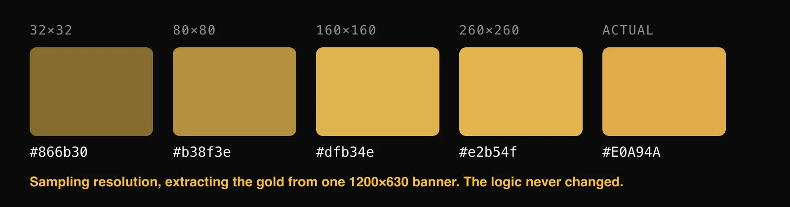
At 260 by 260 the extracted colour lands within a couple of percent of the real brand colour on every site I tested.
There was one more, and it is my favourite bug of the build. My own site came back with a mint green accent. There is no mint green anywhere on my site. My homepage has a strip of logos of companies I have worked for, and the tool was sampling those too, so a former employer’s brand colour was quietly becoming mine. It now samples only the two assets a site explicitly nominates to represent itself, the og:image and the icon.
What I would still change
Every ad it produces shares one visual grammar. Text on a gradient, with a card holding the product’s own image. That grammar is now well executed rather than static, and I think it is genuinely good enough to run. It is also recognisable, and if I make forty of these they will look like forty of the same thing.
A distinctive ad usually has a device. A UI assembling itself piece by piece, a before and after wipe, an actual screen recording of the product doing the thing. None of that exists in here yet, and adding it is a bigger job than a motion pass, because a device has to be designed per product rather than derived from a URL.
The tool is at github.com/debashisn94/inkwell, MIT, and it needs no API keys. Point it at a URL, rewrite the copy it drafts, render.
The uncomfortable bit is the copy. The research step does a good job of telling you what a product calls itself, and none at all of telling you what it is for or who it beats. I have written the thing so it drafts ad copy from the page and marks every line for rewriting, and I am not sure anyone will rewrite them.